Beauty and the Thug
Report 2024-15
Good day, friends!
Unfortunately, I didn’t manage to finish the update in September, so I’ll at least give you a review of what I’ve accomplished this week.
This week, I made a lot of improvements to the code. Besides the purely visual enhancements, I’ve focused on making the game more user-friendly and understandable. I paid special attention to informing the player about new content—whether it’s available or currently locked. Previously, in many places, I showed images randomly, like 5 out of 20. Now, I’m aiming to give the player more choice. Along the way, I also fixed a number of bugs. For instance, after a RenPy update I made almost six months ago, some animations at the beginning of the game stopped working. I only just noticed this (and of course, I fixed it).
Now, let me show you more clearly what I’ve been working on.
The morning activity selection screen: A bright “NEW” label indicates the presence of new content further along this path. A dim “NEW” label shows that new content exists, but with the current skills and other parameters, it will remain locked. The icons are animated. Most screens also have either a general hint or hover-specific hints for each icon. I won’t be mentioning this again moving forward.
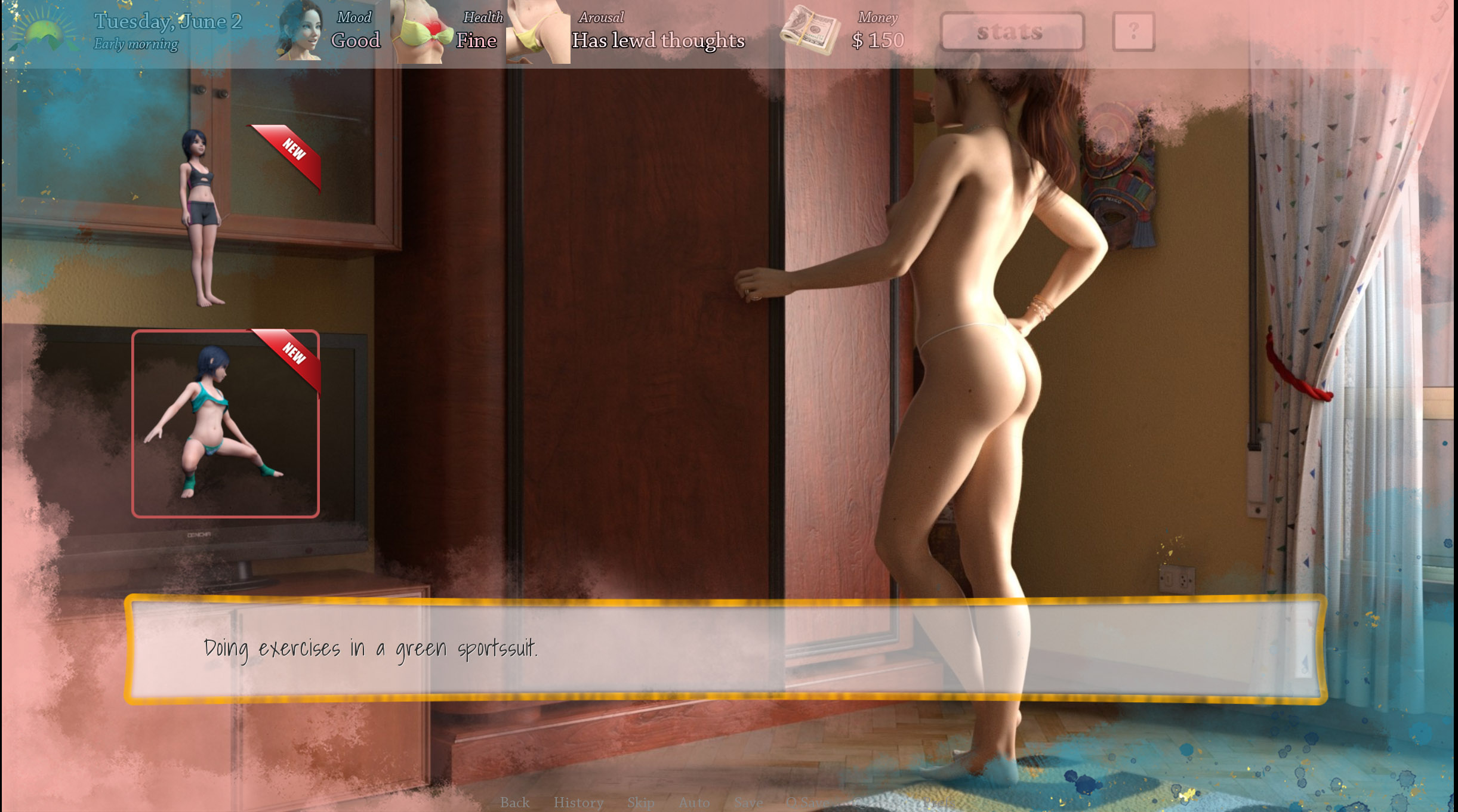
Another example—a sports outfit selection screen. Again, it shows the presence of new content, and the images are animated.
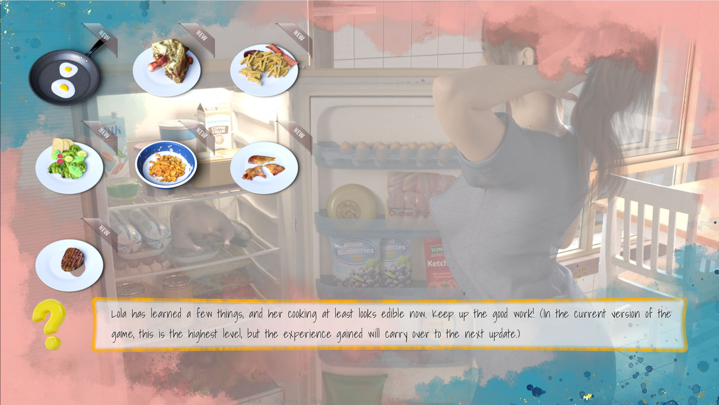
Choosing what to cook is no longer random: the player selects it. A new content indicator is also present. I have some ideas on how to make a choice of what to cook matter and not too grindy, but I’ll leave this for the next updates.
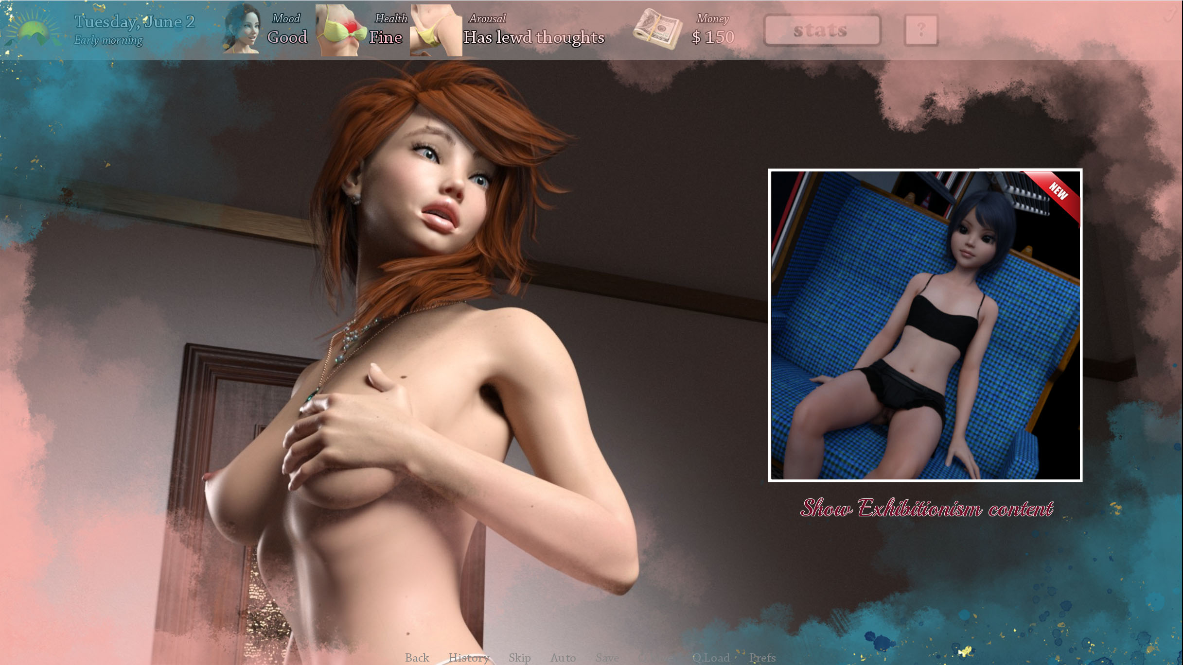
A large icon for starting skill-dependent content. It’s animated and includes an indicator showing that it hasn’t been viewed yet.
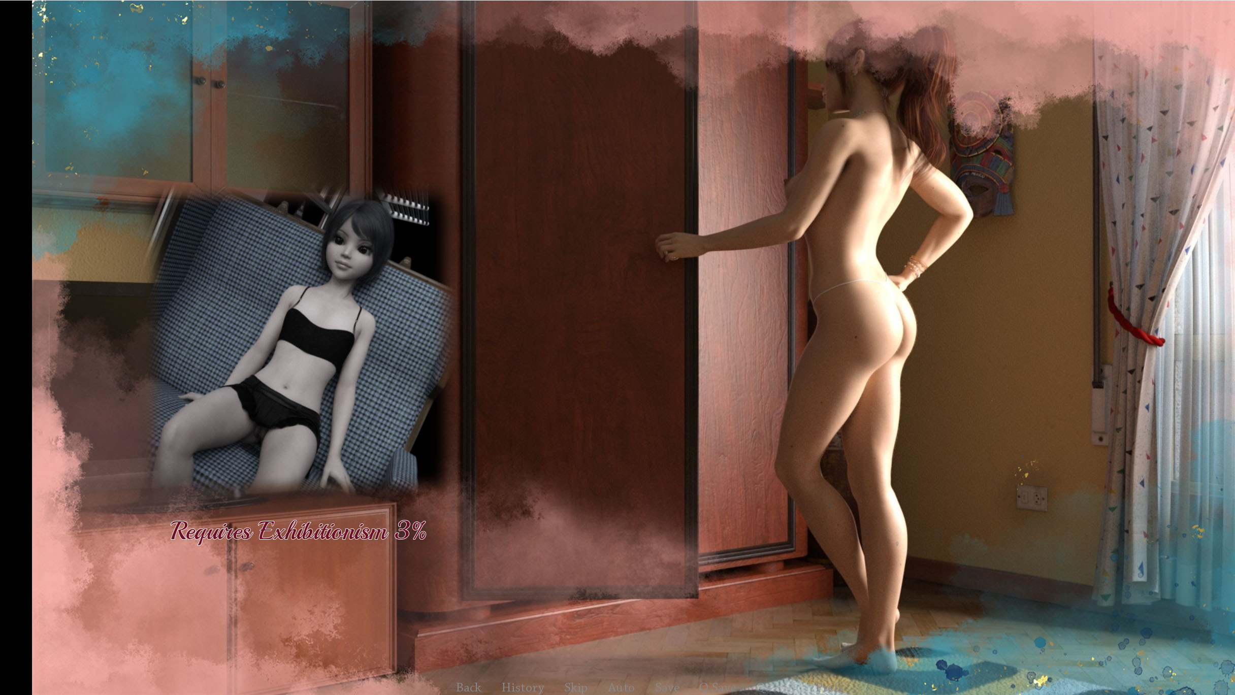
Another example, but this time the content is locked. The note at the bottom indicates what’s needed to unlock the content.
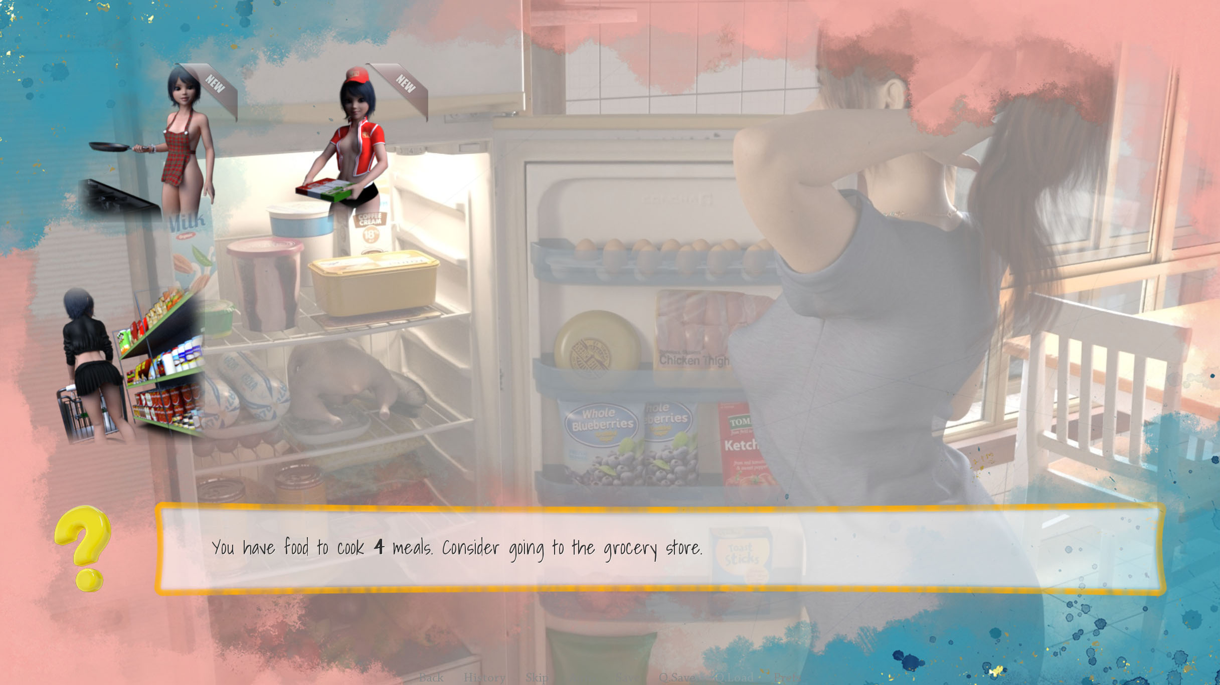
Choose whether to cook, go to the store, or order pizza. The images are animated and include new content indicators.
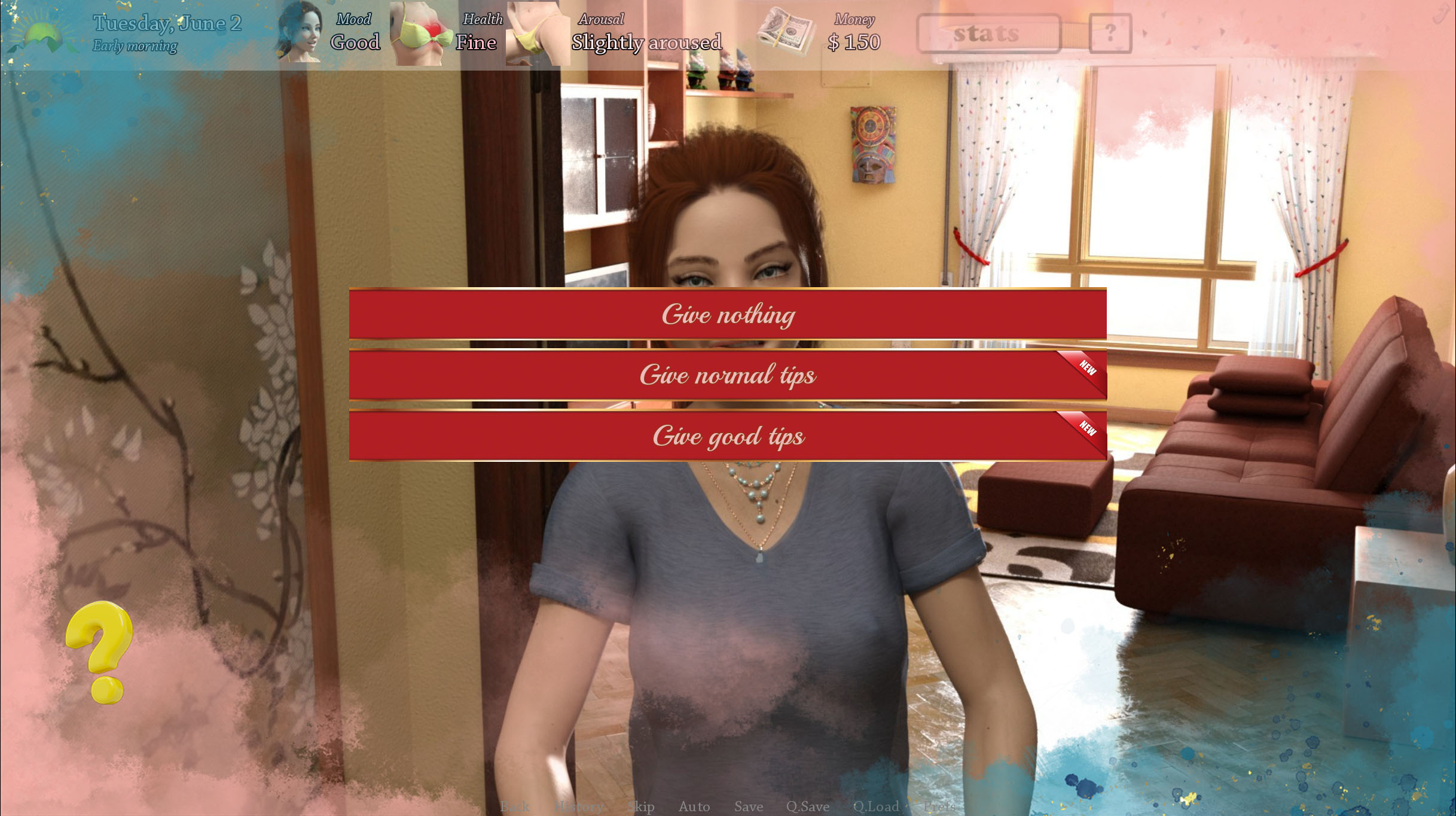
A typical choice menu. There’s also a hint about where to click for new content.
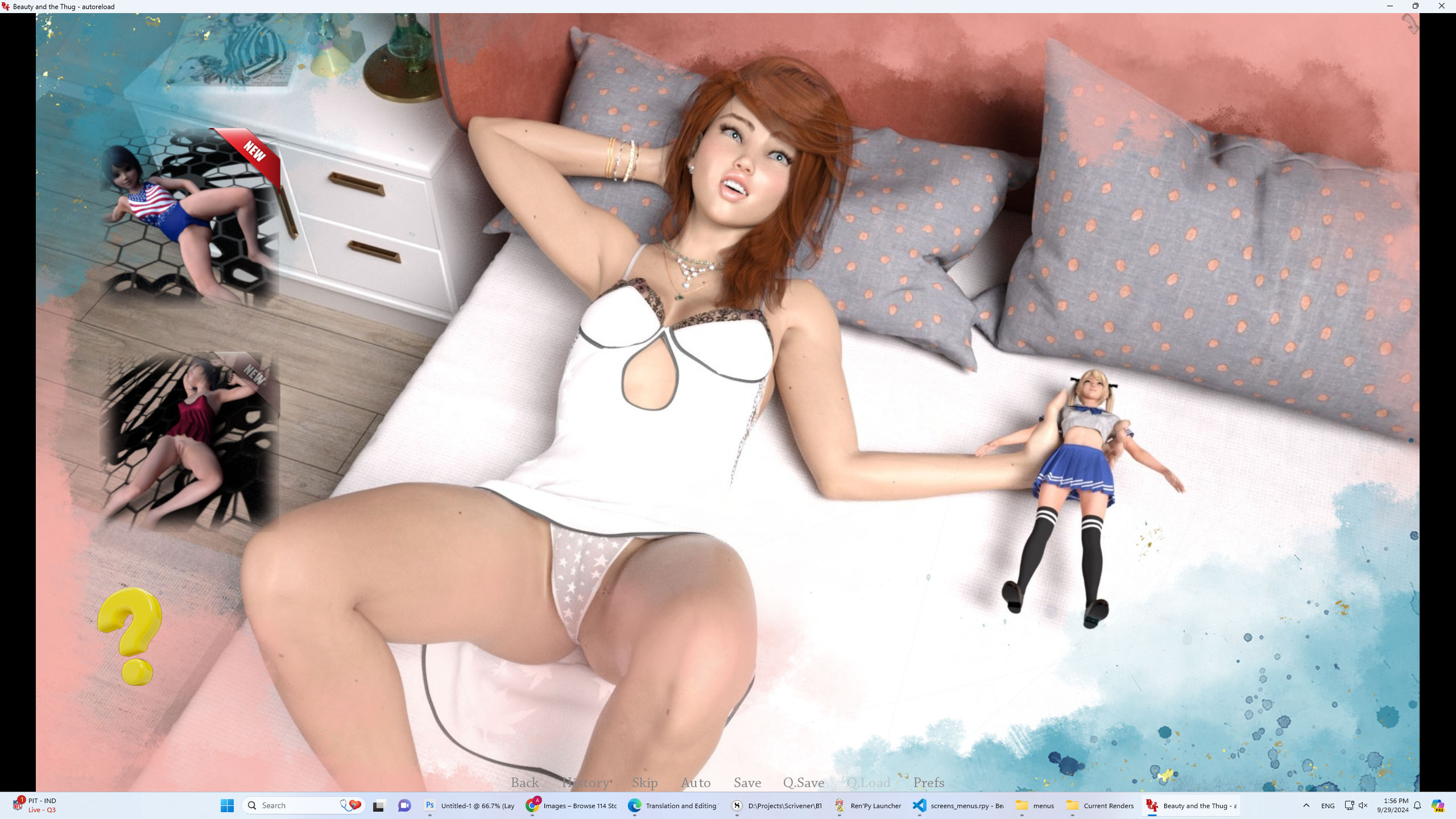
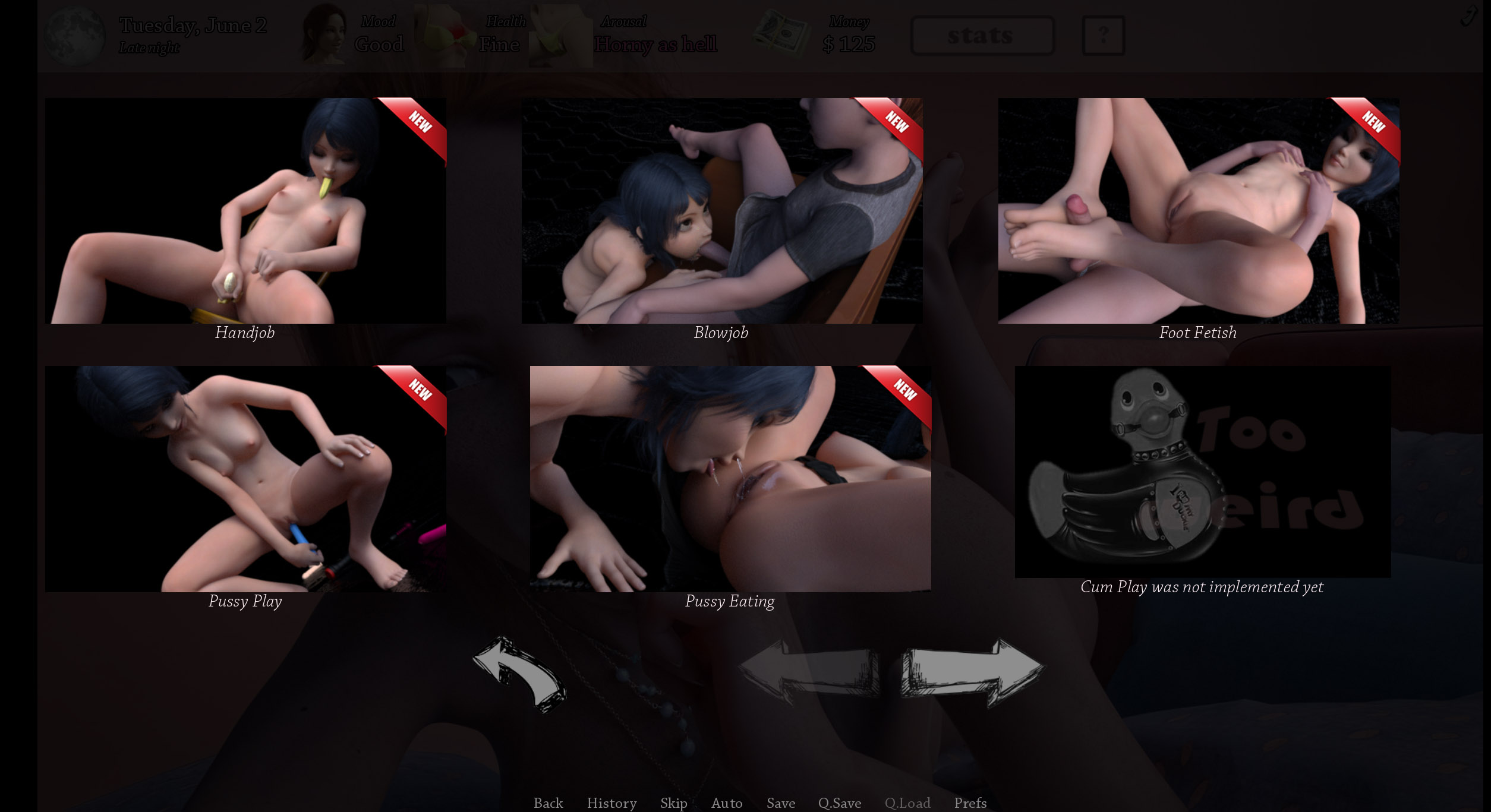
BedPlay. Instead of showing a few random images and animations from the full set, the images and animations are now grouped. Clicking on the cameras in the top-left corner switches between the images. The first time, only the first camera is available; the second time, two cameras; and by the third time, all three are unlocked. So on the third try, you’ll be able to see the entire set of images and animations instead of just a random portion.
The lewd video selection menu has been completely redesigned. Now, the player first chooses the fetish they’re interested in, which I think is much clearer. If something is locked, an explanation is provided. All placeholders now indicate what’s planned to be added rather than being nameless. The images are animated and include new content indicators.
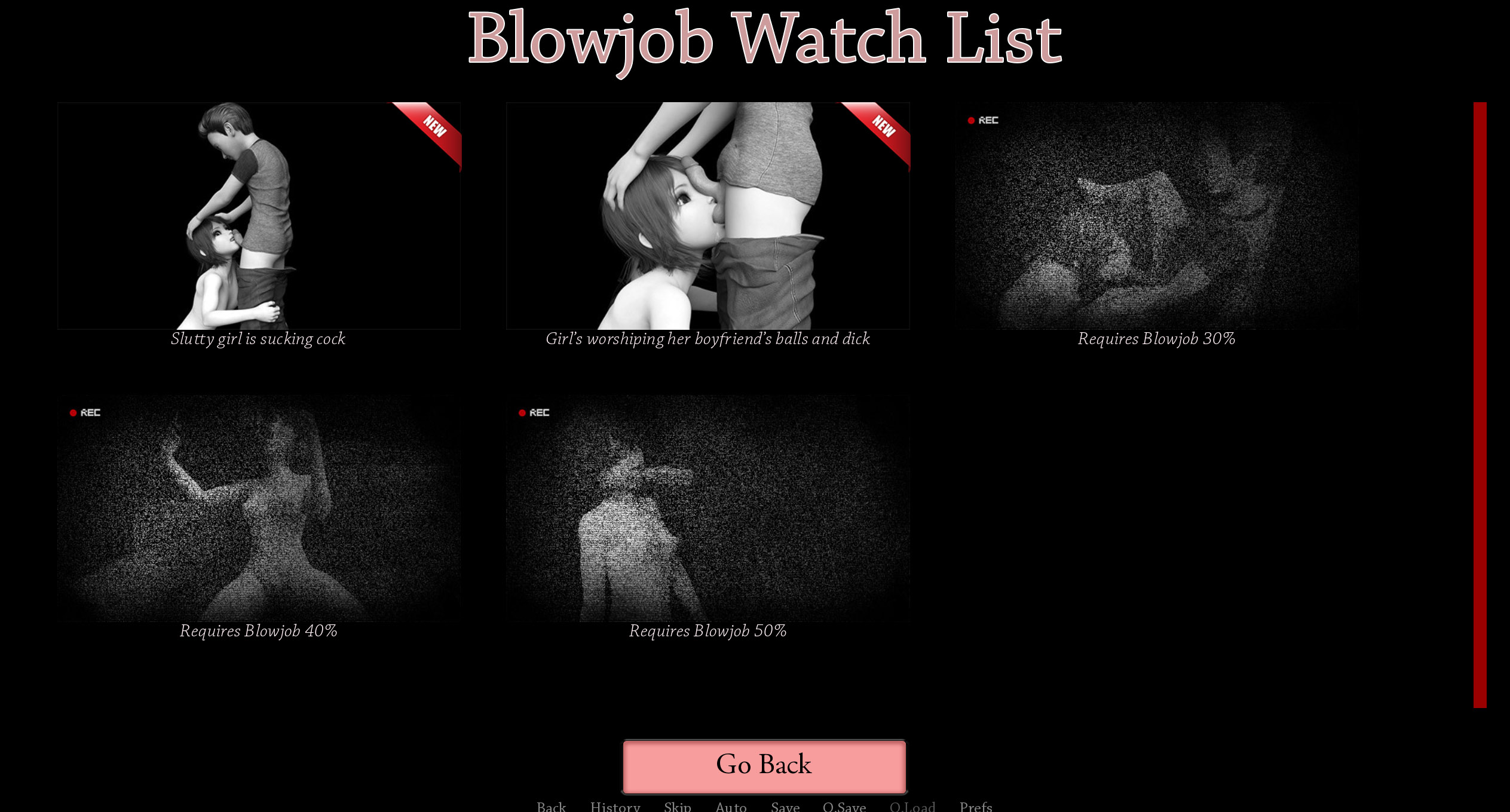
After selecting a fetish, the player sees the entire set of videos instead of just the latest one. Locked videos include information on what’s needed to unlock them. There’s also an indicator showing that a video hasn’t been viewed yet.
So that’s where things stand. It’s turning into a real game overhaul. I’m happy with how it’s coming along, but man, it’s taking a lot of time. Even though I’ve been working late into the night every day, I couldn’t finish it by September, and I really don’t want to release the update in parts.
Anyway, we’ll see how things go next. I’ll see where I’m at by the end of next week, but I won’t make any promises. Again, I apologize for the delay, but I believe the end result will be worth it.
Take care, everyone!
Your zegamez
Comments
Log in with itch.io to leave a comment.
Looks like some awesome updates, upgrades to the UI. Should make it easier to see which option you've not tried yet and what is needed to get to something new.
Looking forward to the next update release!